Beating the Odds: What Makes a School Great?
by: Jess Kerlin
With a 2-year old daughter and an infant son at home, my wife is already planning where we’ll live next with the quality of the schools in mind. Conveniently, Zillow, a popular realty website, supplies a “GreatSchools” score for each nearby public school from 1-10, 10 being the best of the best. Schools in the relatively wealthy University town of Davis typically received scores of 9 or 10, while schools in nearby working class Woodland were rated as 4’s and 5’s. I was curious how these scores were arrived at and what factors make a school “great”.
It turns out the Zillow scores were sourced from GreatSchools.com, and the formula for determining the score was stupidly simple. Just take the grand average student state-mandated test scores for the last 3 years, rank schools across the entire state against each other, and report the school’s decile in this ranking. A school with average scores ranking in the top 10% of the state get a ten, the bottom 10% gets a 1. There are a number of arguments for why state test scores should not be the primary basis for determining school quality. But, even accepting that premise, how much of that score is a reflection of factors that a school has no control over, such as the socio-economic status (SES) of its student population?
To address this question, I took advantage of a very well formatted dataset of 2015 provided by the California Department of Education in the form of a 400+ mb csv file. The file contained test scores for every school and grade level, split by demographic information such as parent level of education. I put this in an SQLite relational database, along with tables linking to the school and district names, addresses, and the Zillow Housing Value Index (ZHVI) by zip code as provided by Zillow. I used Python’s sqlite3 module to query the database and join the required columns and tables, dropping the result into a pandas dataframe. I found that every grade level had a substantially different mean CAASPP score, so I had to normalise each score by grade to prevent high school from having higher scores than elementary schools by default. I extracted the percentage of students in each school/grade in each demographic subgroup, resulting in a condensed 4 MB table with the info I needed.
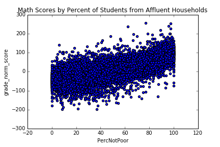
I picked three simplified measures of student SES to model grade normalised test scores at each school: Affluence (% of students not qualified for reduced school lunches), Parent Education (% of students with a college educated parent) and English Nativity (% of proficient in English upon entering public school). All three factors were positively correlated with a school’s average Math score, with Affluence as the most reliable predictor. Affluence alone had a correlation of .75 with test scores, implying that the percentage of poor students accounts for half of the variance of scores between schools.
Ordinary Least Squares regression with all three factors confirmed the dominance of student Affluence in determining a school’s score, followed by Parent Education. Interestingly, accounting for Affluence and Parent Education, English Nativity was fit as having a slightly negative effect on both math and English scores. This suggests being a native English speaker may not be inherently beneficial to success in school, after accounting for the correlations between non-Native English learners and poverty.
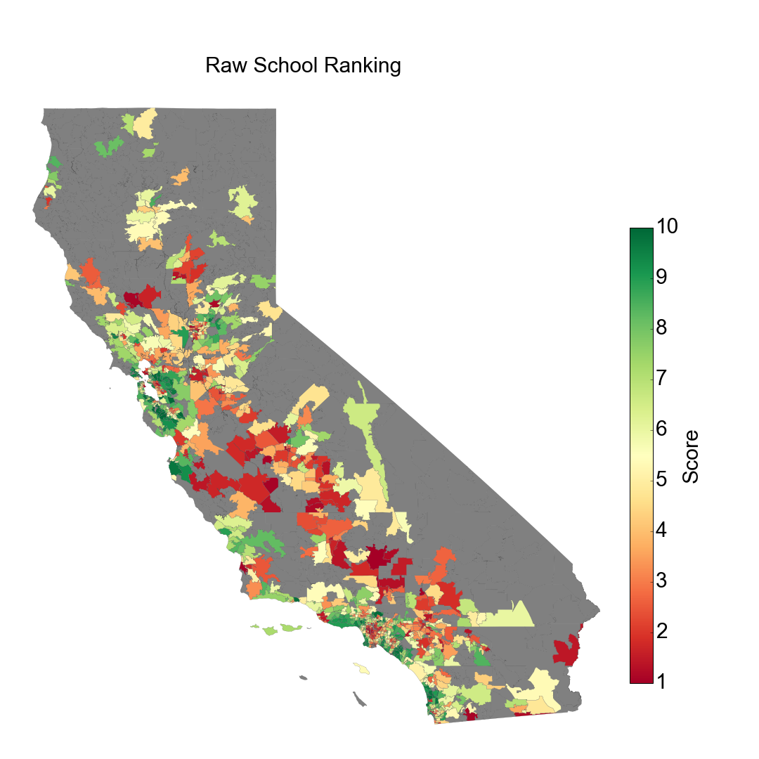
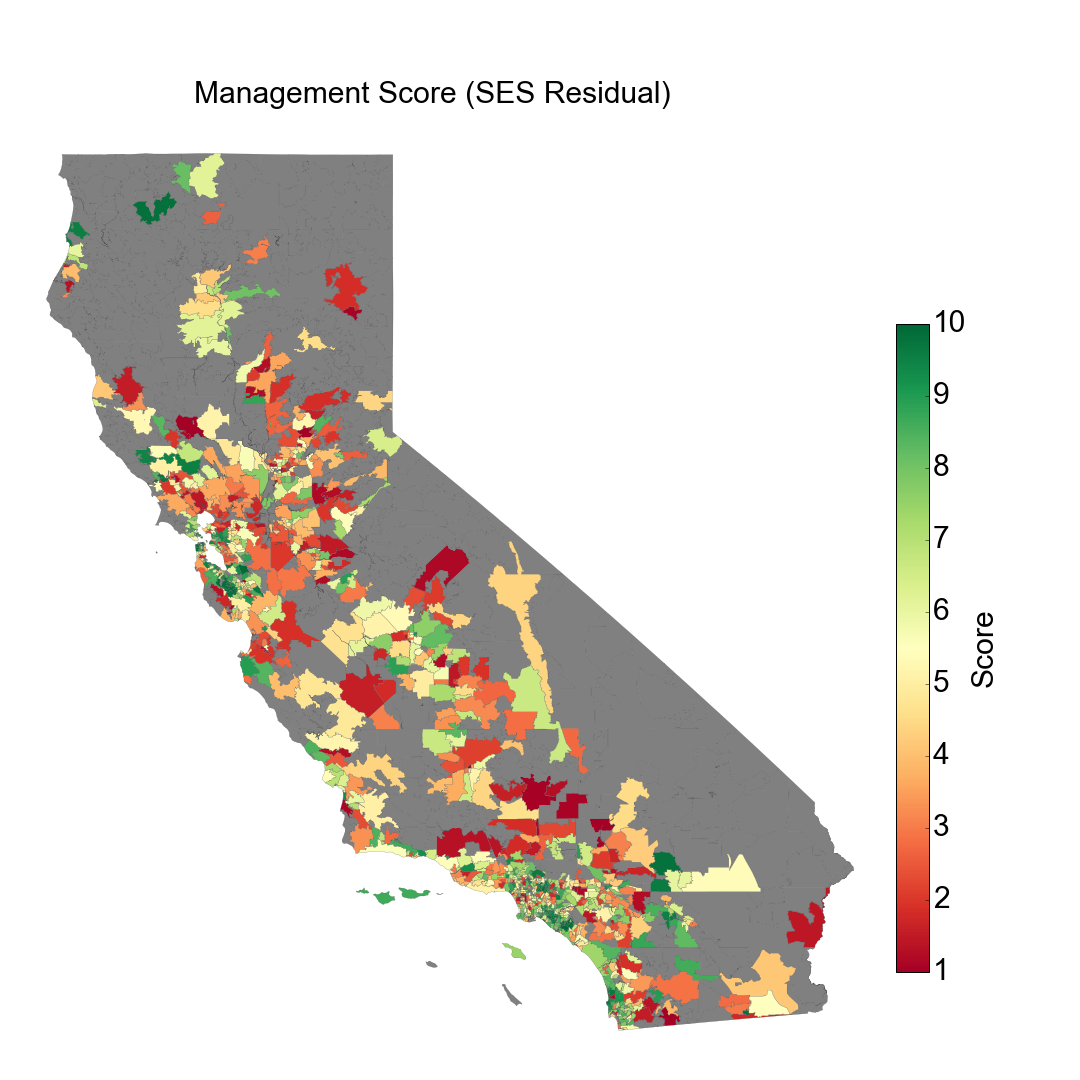
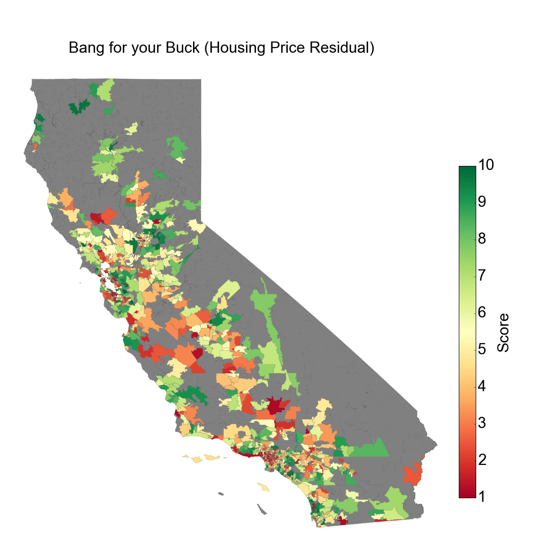
Using this model, I decided to make my own metrics of school success, in addition to the GreatSchool approach of raw test score deciles. A school’s Management Score is based on the residual of the SES model, in other words, the school’s test performance relative to their student’s SES factors that would be beyond a school administrator’s control. I also threw in a Bang for your Buck Score, the residual of a linear fit of housing prices to test scores. This represents how well the school performs compared to the local cost of housing. I output both scores using the same 1-10 decile ranking scoring as GreatSchools, with 10 as the best score. With the help of the mapping approach of Christian Peccei, I was able to make a color-coded map of school performance by zip code for each metric.
At first glance, it can be seen how raw test scores are high in coastal metropolitan areas such as most of the Bay Area and the coastal parts of LA and San Diego, with lower scores at some inner city locations and broadly across the central valley.
However, accounting for student SES, the Management Scores reveal over and under performing schools distributed more evenly across the state.
Accounting for housing prices with the Bang for your Buck Score, the inner Bay Area in particular isn’t a great educational return on investment.
It’s hard to see individual zip codes with these maps, and impossible to identify individual schools. So I decided to make a minimalist website for looking up school performance with my metrics. This mini-site was built with a free hosting account on PythonAnywhere and with Flask, relying heavily on instruction from the PythonAnywhere Flask tutorial and sarahleejane’s simple tables app.
Go ahead and try it! Type in a zip code, click “post zip code”, and see how the schools in that area stack up. Davis schools (95616) still perform well even accounting for its highly educated and well-off demographics. Try West/East Palo Alto (94303) for a study in contrast, with some of the “best” and “worst” schools in the state sharing a zip code but separated by school district and a dried up creek.
Of course, these scores and metrics still don’t tell the whole picture. I’m not an education expert and my model is certainly flawed. I don’t address race, district lines, property taxes, state policies and alternative metrics to test scores, etc, which can’t be covered in a single blog post and are certainly outside my areas of expertise. In fact, it can be argued that such simplified metrics, presented along housing listings may be exacerbating the problem of social/racial stratification. You can visualize this stratification in one of the most beautiful and eye-opening visualisations I’ve ever seen, created by Dustin Cable. GreatSchools addresses some of these issues with more detailed metrics on their website, introduced in just the past couple of weeks. As of this posting, Zillow still just displays one rating.
Rather than be taken at face value, I hope that visualising and browsing such metrics will highlight the gross inequality in education across the state and assist in the conversation of how to remedy it.